Project Overview

Problem:
Outdated website
Outdated website
What I did:
1. User research (feedback & survey)
2. Competition research (References, Pros & cons mapping)
3. Architecture (Sitemap & Wireframes)
4. User Interface Design
5. Handoff (Design and Style guide)
2. Competition research (References, Pros & cons mapping)
3. Architecture (Sitemap & Wireframes)
4. User Interface Design
5. Handoff (Design and Style guide)
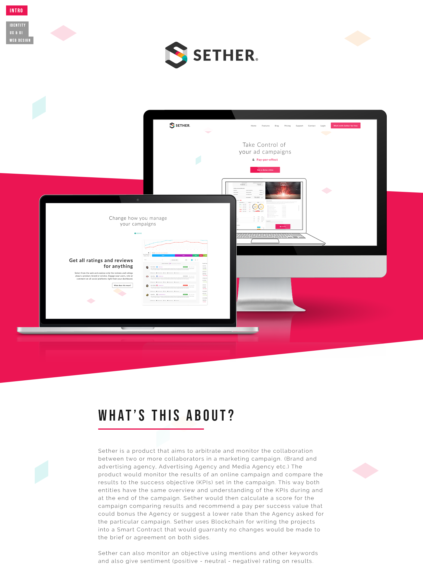
Intro
Once upon a time, in the vast world of the internet, there was a company called tokinomo. They were pretty awesome at what they did, but there was one problem: their website was stuck in the past. It looked outdated, and the organization was all over the place. It just wasn't cutting it anymore.
Chapter 1: The Call for Change
That's when they decided to reach out to me, a UX designer extraordinaire. At first, they only wanted a facelift for their website. You know, a fresh coat of paint and some new fonts. But after a few heart-to-heart conversations and some deep-dive research, I managed to convince them that a mere facelift wasn't going to cut it. We needed to go deeper. We needed to dive into the world of UX design.
Chapter 2: Embracing the Adventure
The primary challenge was to address the client's dissatisfaction with the website's visual aesthetics and enhance its usability. However, it was equally important to redefine the website's information architecture, to create a more intuitive and user-friendly experience. Furthermore, the project had to be executed within the constraints of HubSpot.com
Chapter 3: Unearthing Insights
Before diving headfirst into the design process, I needed to gather some intel. I pored over the current website, gathering user feedback and scouting out similar websites. I wanted to know what was working, what was falling flat, and what could be improved. Armed with this knowledge, I sat down with the tokinomo team to understand their business goals, target audience, and desired outcomes. This involved creating a survey for their clients and employees to get a bit more feedback from closer sources.
Chapter 4: Building a Strong Foundation
It was time to address the website's organization. The sitemap needed a makeover, and the content hierarchy needed a good shake-up. I reimagined how users would navigate the website, ensuring that finding information would be a breeze. No more endless clicks and frustrating dead ends!
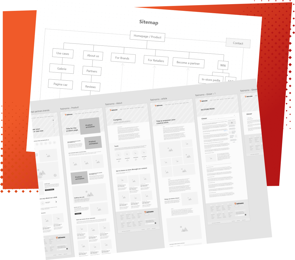
Chapter 5: Sketching the Path Forward
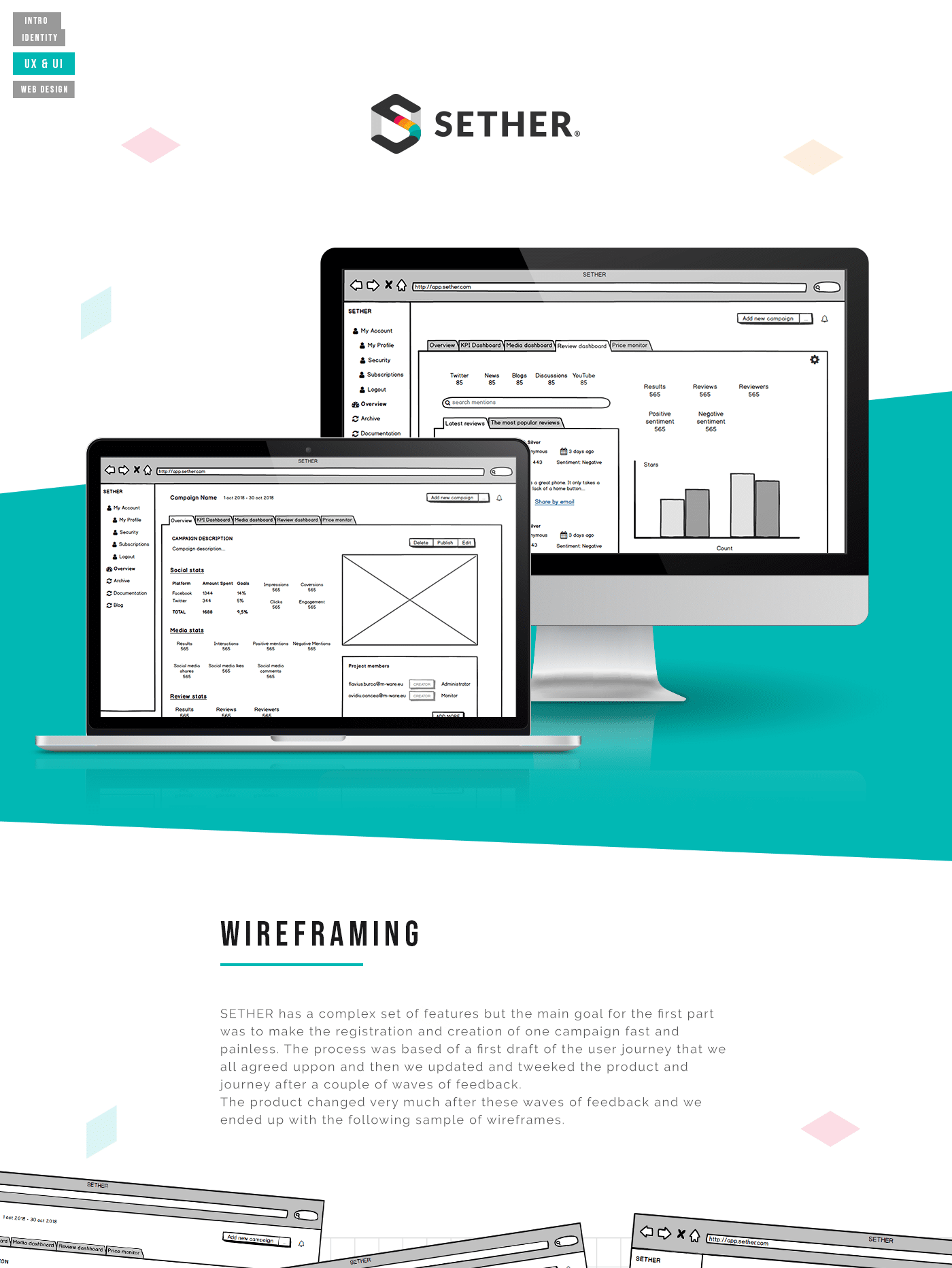
Wireframes became my best friends. These nifty blueprints allowed me to visualize the proposed changes and allowed for iterative feedback. They also served as the foundation for the new website's design and provided a tangible representation of the improved user experience.
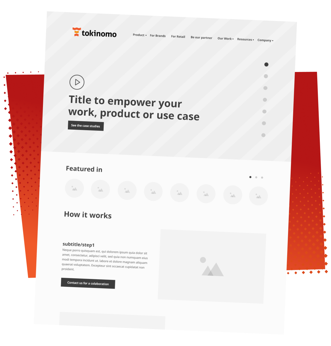
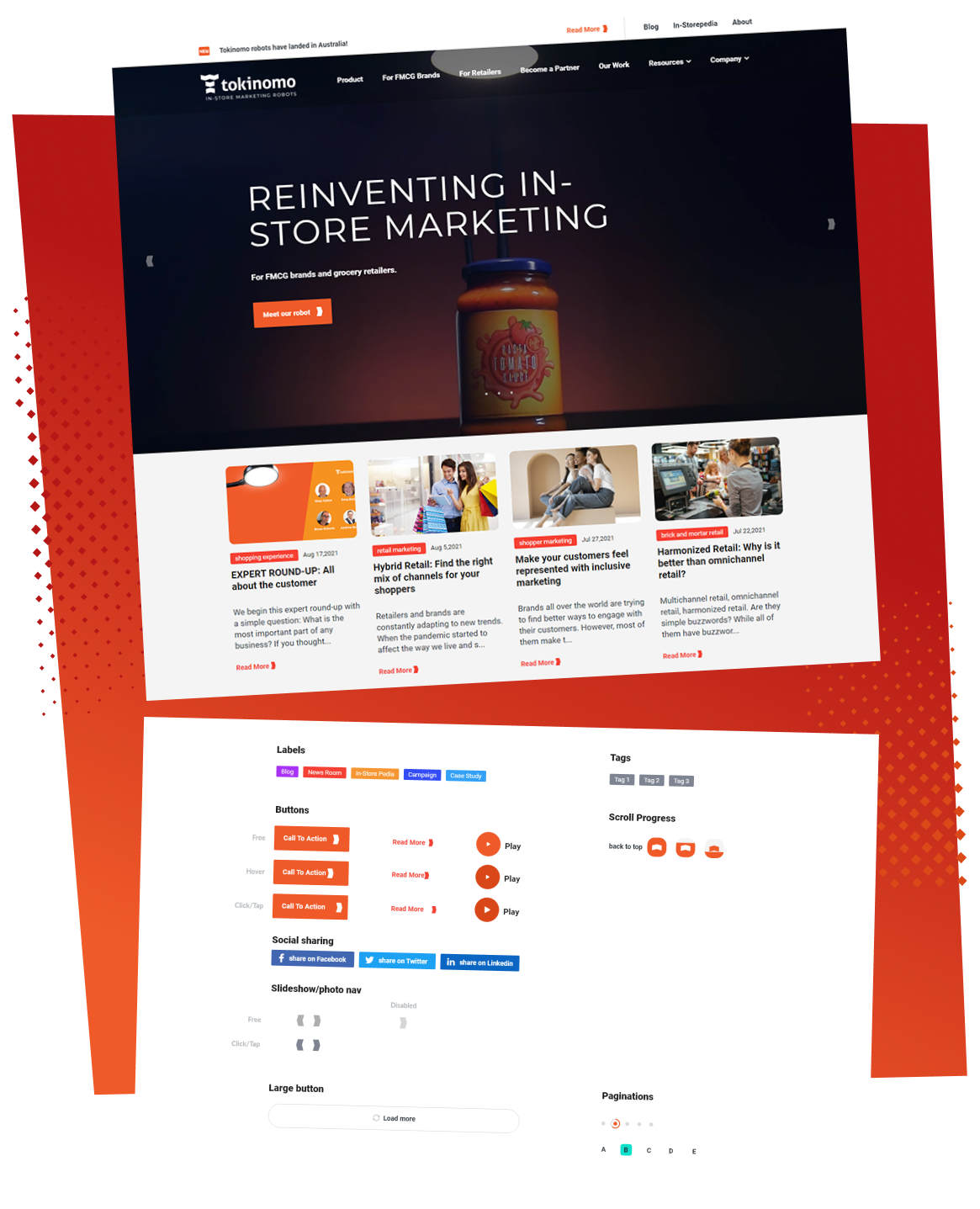
Chapter 6: The Visual Transformation
The palette of eye-catching brand colors, some sleek UI elements, and a knack for aesthetics, and the website's look and feel was transformed. Complete wardrobe makeover head-turner.
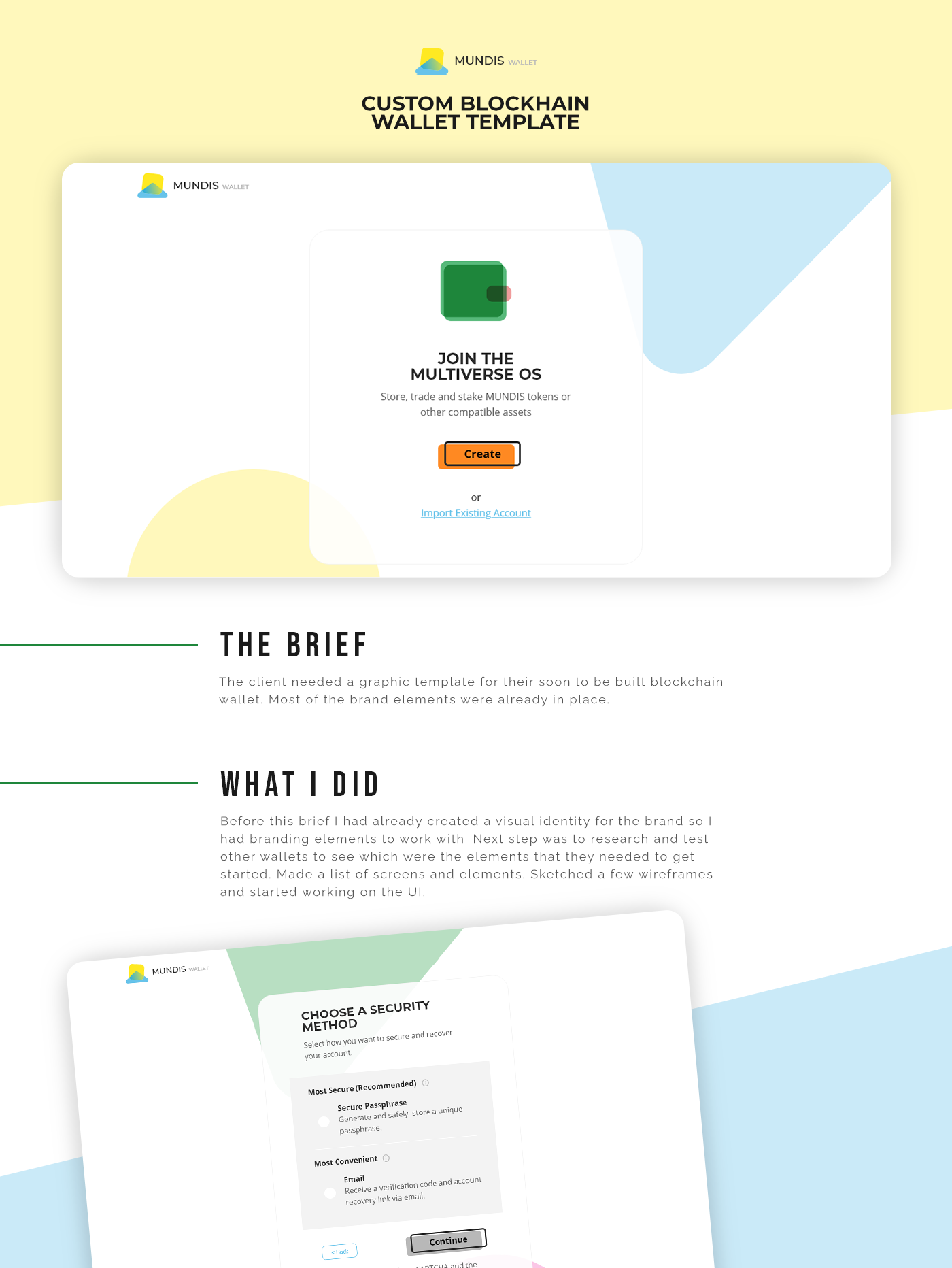
Here is but a sample of the whole thing:
So, yes...you can visit the website here:
And I also included an XD export of the prototype below