ETHAX
A blockchain trading app for the people who want to invest but don't want to become traders. Built around pre-set automated strategies, with the experienced-trader interface preserved. UK client, international product.
Project Overview
Problem:
Trading apps speak fluent trader: charts, candlesticks, indicators, order books. Most people who want to invest don't speak fluent trader and don't want to learn. The product had to serve both audiences without compromising either.
What I did:
- Competitive research (3Commas, peer crypto platforms)
- Information architecture & user flows
- UI design for dashboard, strategies, and portfolio
- Light-mode token system on top of the dark-default palette
- High-fidelity prototype handed off to the dev team for build
TL;DR
- Challenge: Build a blockchain trading app that doesn’t ask its users to become traders, without alienating the experienced ones who actually want the charts.
- Scope: Lead UX. Research, IA, wireframing, high-fidelity UI, prototype handoff. Two-month active engagement. The working relationship continued for roughly two more years on adjacent collaborations and consulting.
- Approach: Pre-set automated strategies as the primary path for newcomers. Full trading interface preserved for experienced users. Dark by default, with a light-mode token set on top for users who wanted it.
- Outcome: High-fidelity prototype delivered, iterated through ETHAX-side feedback, and handed off to the dev team for build. The product shipped and is live today at ethax.com. I stayed on for occasional dev support after handoff.

“Andrei’s role was to interact with the ETHAX exec team to help bring ETHAX’s first trading application to life. Graphic design and a working prototype for the ETHAX Trading programme. He’s hardworking and enthusiastic, and a key trait is that he does what he says. When the chance arises again, I would work with Andrei. Outstanding business acumen, a role model for many of his peers.”
Tony Klein, BEng (Hons), Chief Compliance Officer, ETHAX Global Limited
Trading apps are usually overwhelming on purpose. Charts, candlesticks, indicators, order books. Every data point earns its place because the user, supposedly, is going to use it. For an experienced trader that’s the right design. For someone whose entire interest in crypto is “I want to put money in and see if it grows,” it’s a wall.
ETHAX is a UK-based blockchain trading company building for an international audience. When they brought me in, the trading mechanics were mostly in place. The challenge wasn’t technical. It was experiential. “How do you make a trading app that works for both experienced traders AND complete beginners?”
I joined as Lead UX Designer for a focused two-month engagement. The working relationship continued for roughly two more years on adjacent collaborations and consulting, but the design of the trading app itself happened in those two months. My focus was the architecture and the interface. Turning a working trading engine into a product the non-trader could trust and the experienced trader wouldn’t outgrow.
The research phase
Before I touched a wireframe I needed to know exactly what we were building against. I spent the first weeks mapping the trading-app landscape: from the consumer-friendly end (Robinhood, eToro) to the trader-end (Binance, Kraken) to the strategy-marketplace end where ETHAX would actually live. 3Commas became the most useful direct reference: a platform where users can subscribe to other people’s strategies and let the bots run them. I borrowed the card-as-strategy mental model from there and deliberately cut everything that made 3Commas feel like an exchange-for-power-users.
The findings went to both the client and the dev team early. Alignment cheaper before the work than after it.
The key insight:
New traders don’t want to understand the intricacies of trading. They want to trust a system to do it for them.
This wasn’t about dumbing things down. It was about offering a different path. One where users could participate without becoming traders themselves.
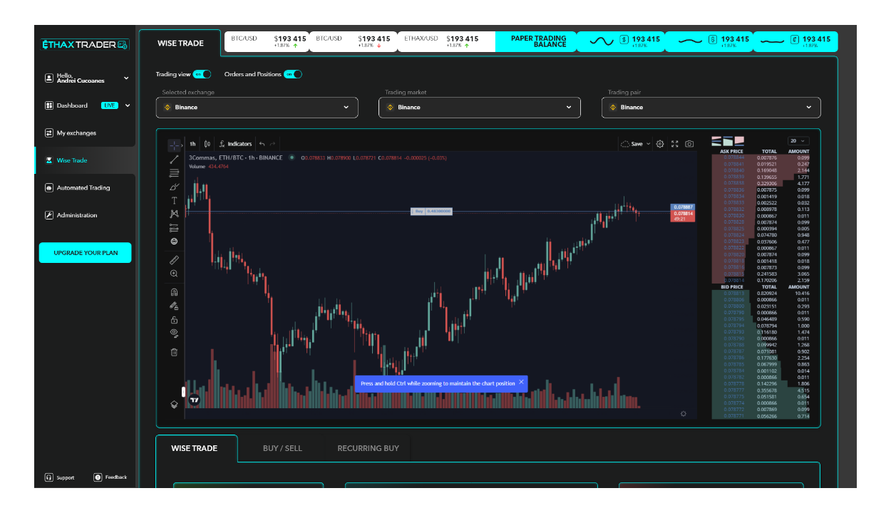
The solution: pre-set automated strategies
The answer was pre-set automated strategies (algorithmic playbooks built by the platform, exposed to the user as choices on a card). Pick a strategy that matches your risk tolerance and your goals. The system handles the actual trading.
Think of it like choosing a playlist instead of picking individual songs. You decide the mood. The algorithm does the rest.
For experienced users, the full trading interface stayed available. For beginners, the strategies became the primary way to participate.
This solved the core tension cleanly:
- Beginners got a simple entry point. Pick a strategy, fund it, let it work.
- Experienced traders kept full data access and manual controls.
- The platform served both without compromising either.
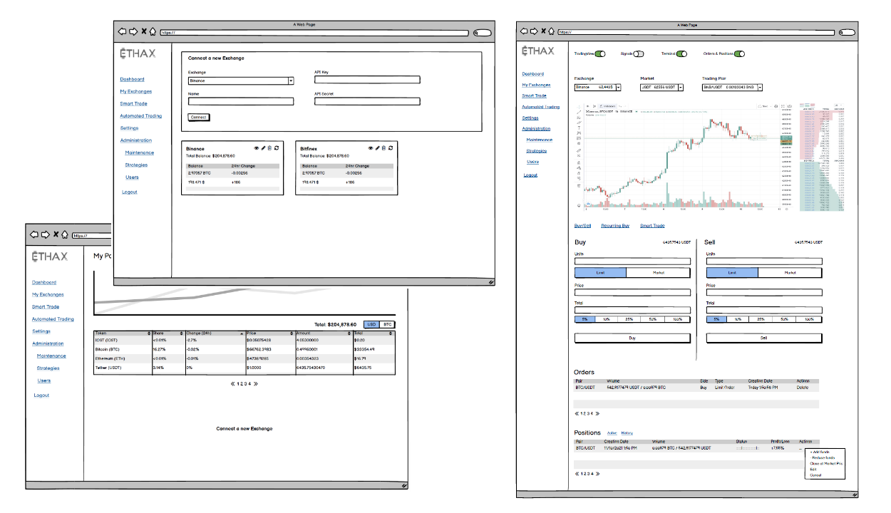
Architecture: three rooms, one product
The app centered around three core areas:
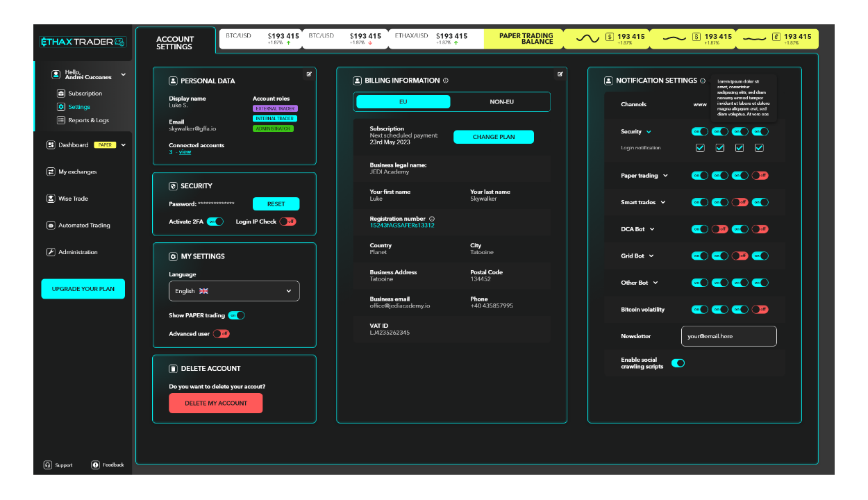
Dashboard The home base. Portfolio overview, active strategies, and key metrics at a glance.
Strategies Where users browse and select automated trading strategies. Each strategy shows its approach and risk level.
Portfolio Detailed view of holdings, transaction history, and performance over time.
Trust is a UX problem on a trading app. Show too little and the user can’t believe their money is safe. Show too much and they bounce. The whole IA was tuned around that line.
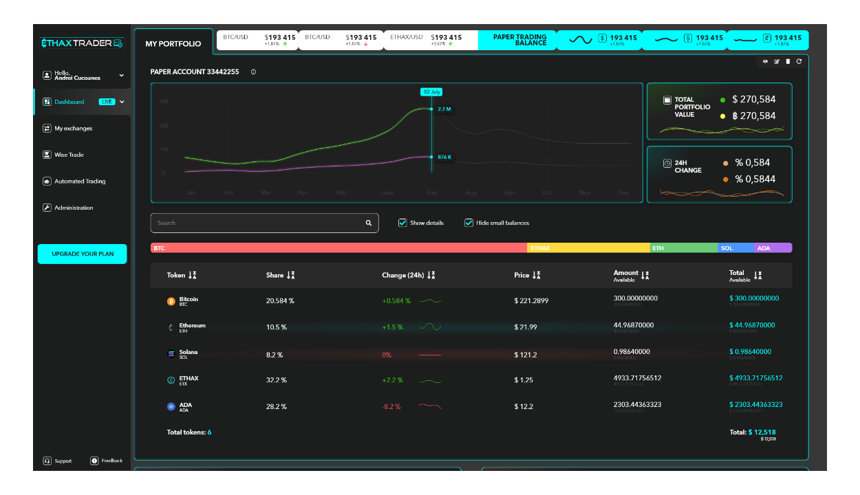
UI Design
The visual design needed to walk a line: professional enough to feel trustworthy with money, but approachable enough not to intimidate.
Trading apps often default to dark themes with neon accents, sort of the “hacker aesthetic.” So I kept it in that register but tried to bring some clear typography, logical groupings, and breathing room between elements.
Key design decisions:
- Progressive disclosure - Advanced options exist but don’t clutter the primary view
- Clear visual hierarchy - The most important information is immediately visible
- Consistent patterns - Similar actions look similar across the app
Adding a light mode without redesigning. Dark-mode-by-default was the right call for the category, but partway through the engagement the client asked for a light version too. Rather than redrawing the screens, I built the light mode as a token-level addition: primitive colors and their semantic replacements, structured so the dev team could flip themes without touching component logic. The actual light-mode build landed on the dev side. The design system handed them the keys.
Outcome
The deliverable from my side was a complete high-fidelity prototype covering dashboard, strategies, portfolio, and the light-mode token additions. The ETHAX team tested it, came back with feedback, and I worked the second round of design through to a clean handoff. From there, the dev team picked it up and built. I stayed available afterward for the smaller design tasks that came up during the build.
The product shipped and is live today at ethax.com.
A trading app that works for people who don’t want to be traders.
What I carried out of it
Two things I now use on every product where the audience splits between novice and expert.
- The “two doors” pattern is almost always wrong. A lot of products solve novice/expert tension by building two separate apps that share a login. ETHAX confirmed the cleaner version: one product, with an opinionated default path for the novice and the full surface available the moment the user asks for it. The novice doesn’t feel patronized. The expert doesn’t feel locked out.
- Theme-as-tokens, not theme-as-screens. The light-mode addition arrived mid-engagement and could have meant redrawing every screen. Building it as token-level swaps (primitive colors with semantic replacements) meant the dev team could ship the second theme without me touching the components. Theming is a system problem, not a screen problem, and the cost of getting that right early is paid back the next time someone asks for a third theme.
Shall we collaborate?
Either way, let's start with a short meeting so you get to know me even better and I you.
Let's start with "Hello there!"