LegalDocs.com
Making legal documents effortless through **research-driven UX optimization**... **LegalDocs.com**
Project Overview
Problem:
Legal documents are intimidating, expensive, and time-consuming for everyday people and small businesses.
What I did:
TL;DR
- Challenge: Build a legal document platform from scratch that makes complex paperwork accessible to anyone
- Scope: User research, full product design, brand identity. End to end ownership
- Approach: Guided flow with contextual help, cross-device experience, but with a focus on mobile, and a flexible pricing model
- Outcome: Successfully launched MVP with 15+ document types across Business, Personal, and Real Estate
Legal documents can be pretty intimidating. They’re full of jargon most people don’t understand, they usually require expensive lawyer fees, and the whole process feels overwhelming. The thing is that everyone needs them at some point. Whether it’s a lease agreement, a will, an NDA, or a power of attorney.
With LegalDocs.com, we wanted to change that. The goal was to create a platform where anyone could complete legal documents in minutes with confidence. Whether you’re an individual handling personal matters or a business managing contracts. The challenge wasn’t just building another form-filling tool. The market already had established players like eForms and LawDepot. We needed to build something that was at least on par with the competition from day one, while delivering a more intuitive experience that truly lived up to the tagline: “Legal Made Effortless.”
I joined as the Lead UX/Product Designer with full ownership across three domains:
- Brand Identity (this was not required of me) I developed the positioning, visual direction, and tone of voice that would make legal documents feel approachable rather than intimidating. This was a task I took upon myself as I had the experience of working with brands in my past advertising roles and felt the need to have this approach because most of the players in this industry were kinda underestimating it. Having a personality closer to the people, a brand.
- User Research I conducted competitor audits, user interviews, and analytics reviews to understand what users actually struggled with.
- Product Design I designed the complete experience. Information architecture, user flows, interface design, and the design system that would be used across all document types.
This wasn’t a handoff-heavy process. I owned the vision from brand strategy to shipped pixels.
Positioning
“Legal Made Effortless” became more than a tagline. It was the design principle that guided every decision. Legal services had historically positioned themselves as serious, authoritative, even intimidating. We took a different approach.
- Trustworthy - people are signing legal documents, after all
- Accessible - not stuffy or corporate
- Modern - reflecting the simplicity of the digital experience
Visual Direction
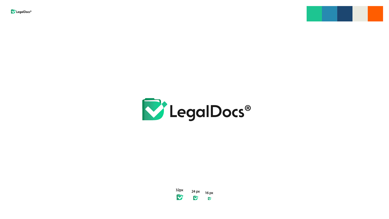
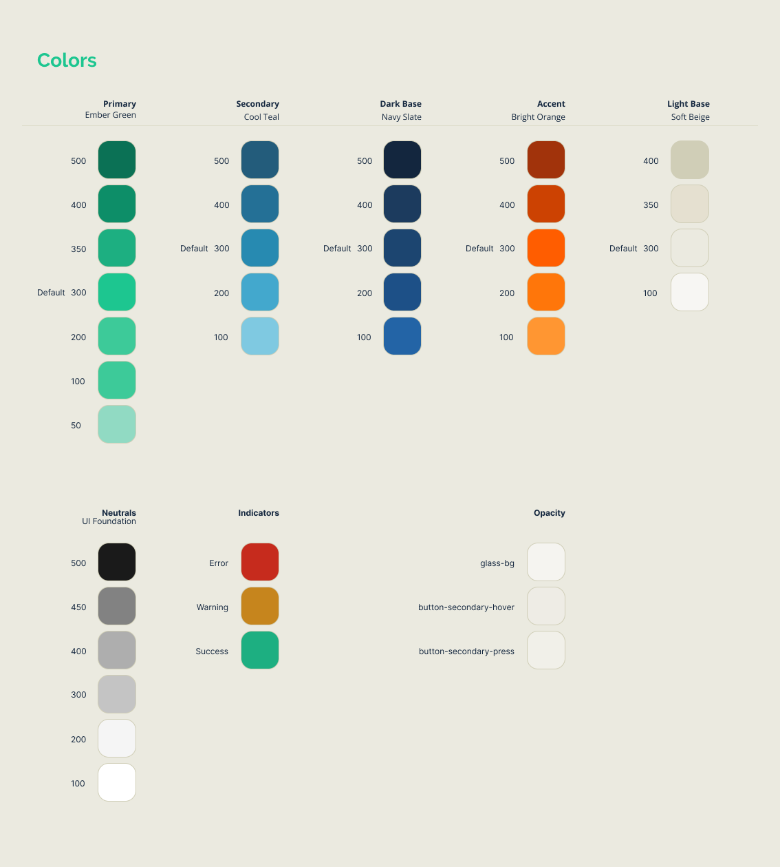
The visual language was built around clarity and a bit more warmth. Softer colors but still in the register of a professional, trustworthy tool.
The tone of voice matched: plain language that demystifies legal jargon, professional but never condescending. When a user encounters a term like “indemnification,” they shouldn’t need a law degree to understand it.
Methods
Before designing anything, I needed to understand the landscape:
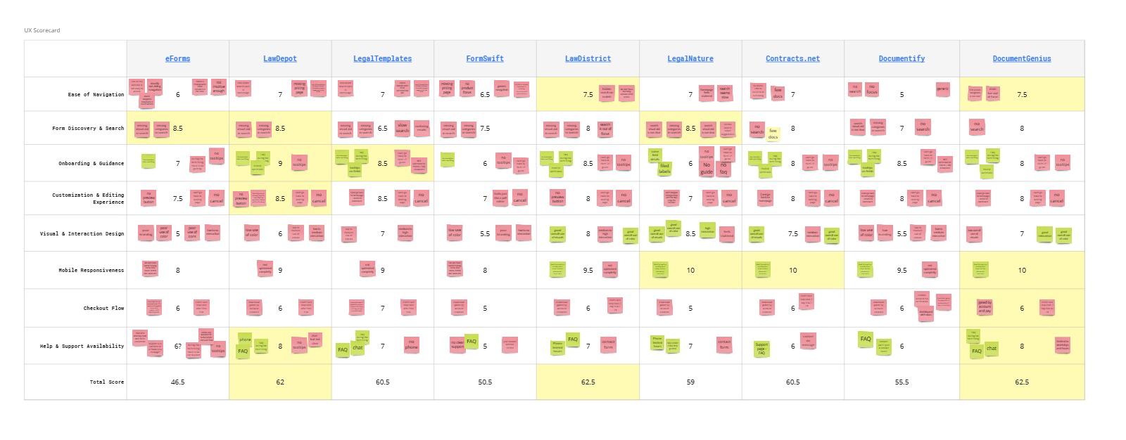
- Competitor product audits - Deep analysis of eForms.com and LawDepot.com as primary benchmarks, plus seven other players (Legaltemplates, FormSwift, Lawdistrict, LegalNature, Contracts.net, Documentify, DocumentGenius). I analysed the same flow for the same form on all competitor platforms, created scorecards for each, and noted the practices they had that had potential to lead users to drop, as well as the ones that could lead to the opposite of course.
- User interviews - Conversations with people who had used legal document services before. This, combined with the user reviews from the competition led to creating 4 personas that would fit the use cases and/or mindsets of the users for this type of product: personal, solopreneur, employee, and employer.
- Analytics review - Understanding user behavior patterns and drop-off points
I used AI tools to compile competitor research and organize findings across nine different platforms, which freed up time for deeper analysis and insight synthesis.
The Key Insight 1 (product related)
Users got stuck on legal jargon and didn’t understand the meaning or importance of their options.
People would reach a question like “Do you want to include a severability clause?” and freeze. They didn’t know what it meant, whether they needed it, or what would happen if they chose wrong. This uncertainty caused abandonment or worse, documents completed incorrectly.
This insight directly shaped what became the product’s core: contextual help at every decision point.
The Key Insight 2 (business and product related)
Users find this type of product really usefull, but their most often complaints were about price transparency and the complexity or lack of canceling a subscription.
This insight underlined the lack of trust users had for these platforms, as they were offering a product they needed, but also subscription traps. There for we needed to have these aspects clear and transparent.
The platform needed to serve both individuals and businesses across a wide range of document types. I organized the experience around three clear categories:
- Business — Bill of Sale, NDAs, LLC Operating Agreements, Partnership Agreements, Commercial Leases, Employment Verification
- Personal — Wills, Power of Attorney, Prenuptial Agreements, Child Travel Consent
- Real Estate — Lease Agreements, Eviction Notices, Purchase and Sale Agreements
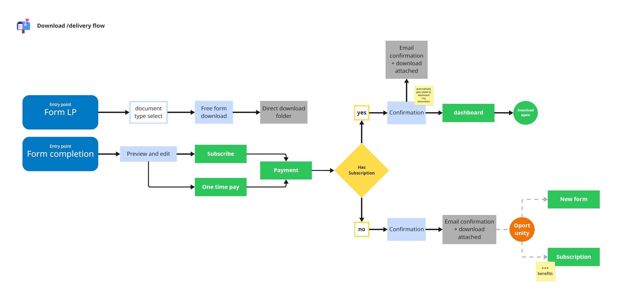
The download document user flow was pretty simple: Choose → Complete → (Optional) Free Account → Pay → Download.
Building the architecture
After the research phase wrapped up, it was time to start building. I began with user flows to map out the complete journey, then moved into low-fidelity wireframes to test the structure and information hierarchy.
During the wireframing phase, I also started fitting in content for the public pages. This helped validate that the layouts could handle real copy and messaging before committing to high-fidelity designs.
Once I got sign-off on the flows and wireframes, I moved into building the actual interface. This is where all the research insights and structural planning came together into the polished product.
The Form-Filling Experience
This was the heart of the product, and where the research insight became reality.
The problem: Legal forms ask complex questions in confusing language.
The solution: A guided experience that never leaves users stranded.
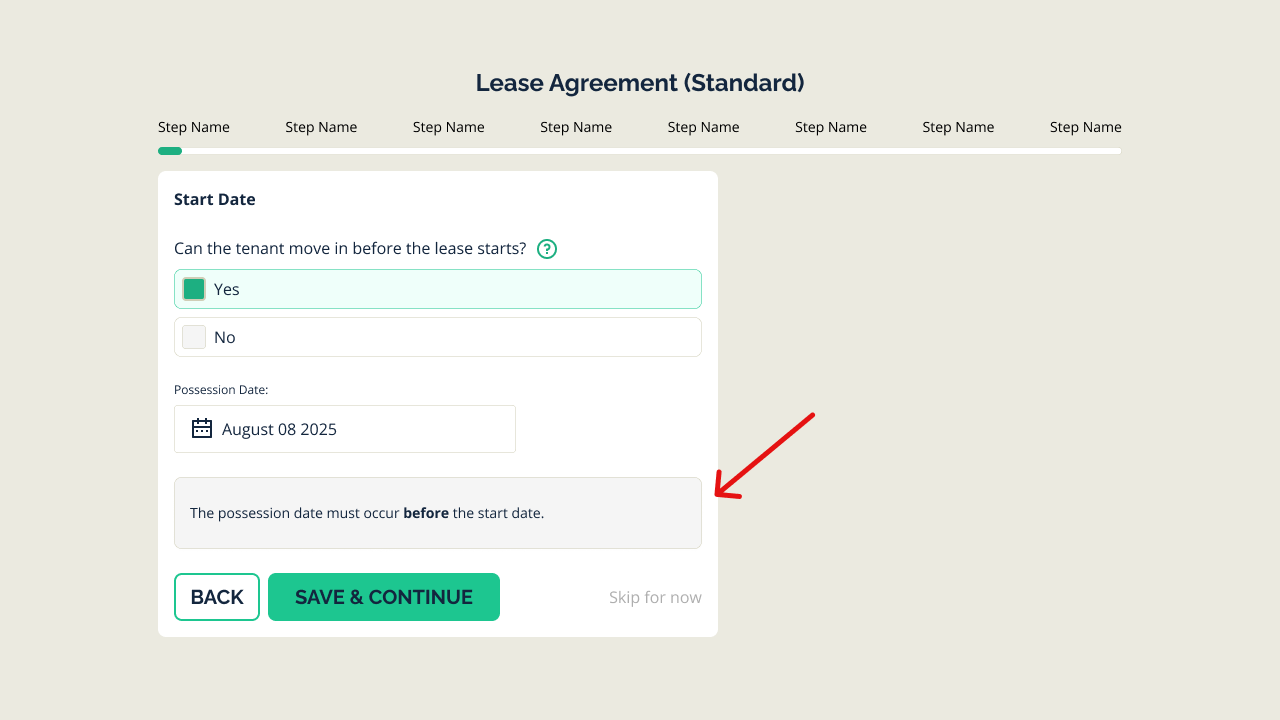
Contextual Tooltips
Every potentially confusing term gets a plain-language explanation. Hover or tap, and you see what “severability clause” actually means in words anyone can understand.
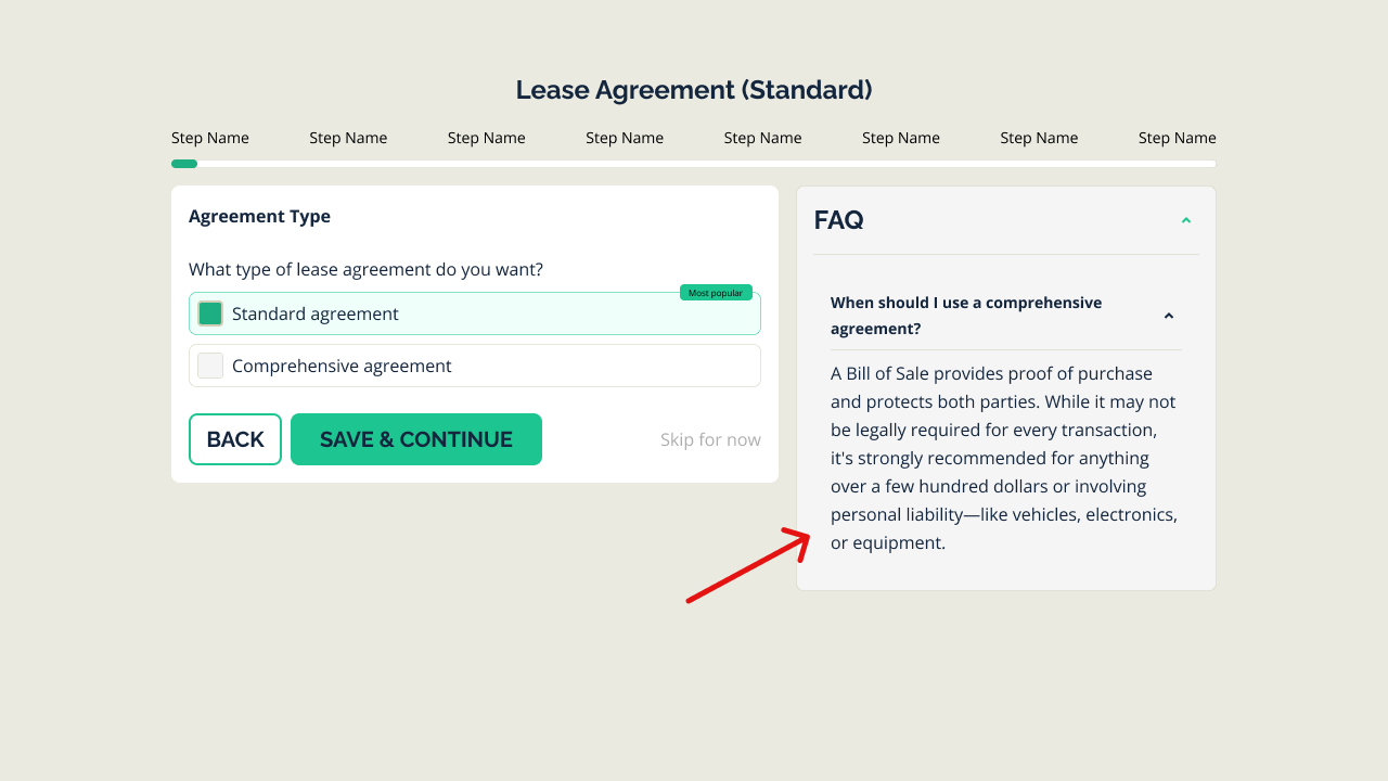
FAQs at Point of Need
Rather than burying help in a separate FAQ page, relevant questions appear right where users encounter them. “Why do I need this?” and “What happens if I skip this?” get answered in context.
Smart Recommendations
When users face optional fields or complex choices, the system provides guidance. Not making decisions for them, but giving them the confidence to make informed choices.
I leveraged AI to draft initial tooltip copy and FAQ content, then refined everything for legal accuracy and brand voice consistency.
Progress & Continuity
Users always know where they are in the process. A clear progress indicator shows completion status, and cross-device continuity means they can start on mobile during lunch and finish on desktop at home.
Visual Design
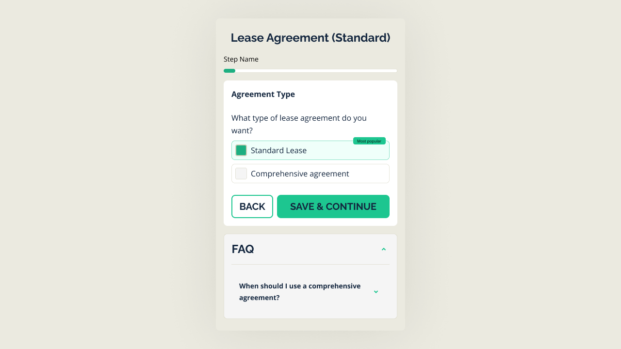
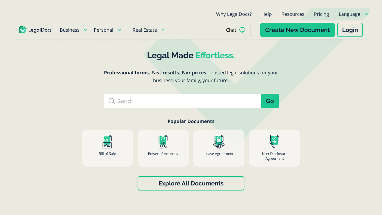
The interface design reinforced the brand promise of effortlessness. Every screen was designed to feel calm, clear, and manageable, even when dealing with legally binding documents.
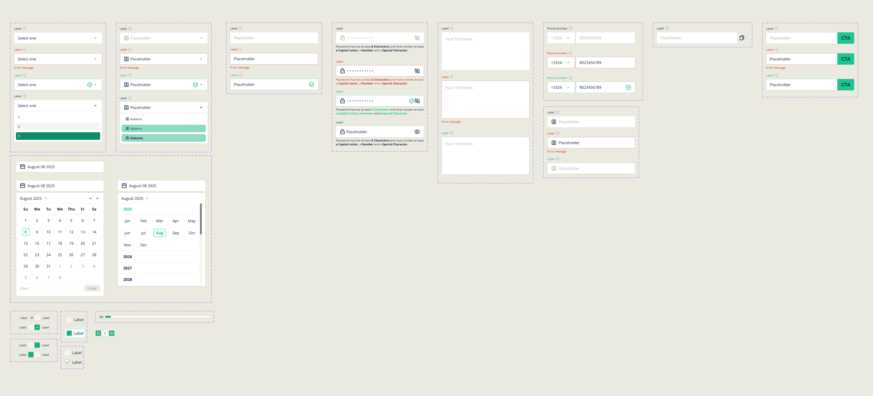
With 15+ document types and more planned, consistency was critical. I built a component library that could scale:
- Form field patterns that worked across all document types
- Consistent help and tooltip components
- Flexible layout systems for varying content lengths
- Responsive patterns for mobile completion
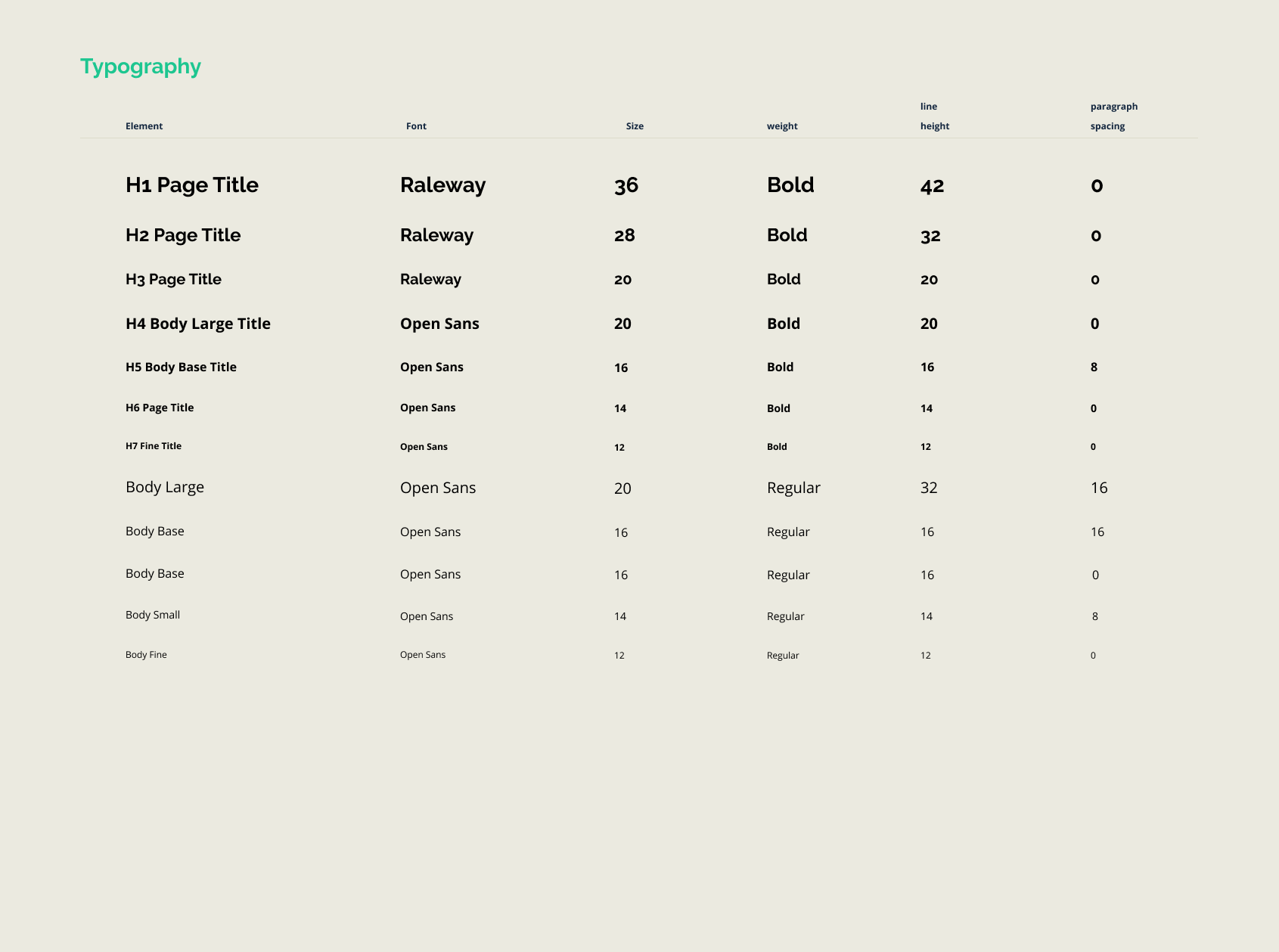
- Everything backed and packed into tokens and styles for the nice play with the DEV team
MVP Launch
The platform launched successfully with:
- 15+ document types across Business, Personal, and Real Estate
- Flexible pricing - 7-day free trial plus one-time purchase options for users who only need a single document
- Cross-device experience - start anywhere, finish anywhere
Post-Launch Iteration
Launching was just the beginning. With real users in the product, we could see exactly where they struggled and succeeded.
Based on user behavior data (Hotjar session recordings and GA4 data), I made targeted improvements:
- Optimized form flows - Reduced drop-off by simplifying steps where users hesitated
- Enhanced contextual help - Added explanations at specific points where analytics showed confusion
- Refined pricing touchpoints - Adjusted the trial-to-purchase flow based on conversion data
This wasn’t guesswork. It was data-driven iteration that improved the experience measurably, having the product start recording a profit over the marketing spend in about 3 months.
Challenge Overcome
Speed vs. Quality
The biggest challenge wasn’t a design problem. It was a business reality. There was constant pressure to ship fast. Features needed to launch. Competitors weren’t waiting.
But rushing a legal document platform is risky. Users are signing binding agreements. A confusing interface doesn’t just hurt conversion. It could lead to incorrectly completed documents with real consequences.
I navigated this tension by:
- Prioritizing ruthlessly — Shipping the core experience first, with polish coming in iterations
- Using data to advocate — When I pushed back on cutting corners, I had research to support why certain UX elements were non-negotiable
- Building scalable foundations — The design system investment slowed us down initially but paid dividends as we added document types
Simplicity is hard, especially when the underlying domain is complex by nature. The real design work wasn’t making things look good. It was making legal language accessible without oversimplifying it.
Respecting user intelligence while acknowledging their unfamiliarity. People aren’t stupid. They just haven’t gone to law school, sooo… I bridged the gap.
Legal made effortless. That was the promise, and the product delivers on it.
Shall we collaborate?
Either way, let's start with a short meeting so you get to know me even better and I you.
Let's start with "Hello there!"
